HEALTH BUDDY

Redesigning the SingHealth mobile app for a better user experience.
MY ROLE
Co-Project Lead
User Research Lead
Usability Test Lead
TIME
5 weeks (Aug 2022)
TOOLS
Figma
Figjam
RESULTS
Improved SUS score by 37%
Functions were more intuitive to use
Interface was more visually pleasing
Important information could be found easily

About the project
In my first group project of the UX course, I worked with 4 teammates to redesign a better user experience for the SingHealth Health Buddy mobile app. As I had experience leading agile project teams, I took on the role of Co-Project Lead to help steer the process. I also oversaw the User Research and Usability Testing and ensured we gathered robust feedback data.
About Health Buddy
Developed by the SingHealth Group, Health Buddy aims to give users convenient and timely access their health services and information. Its main features include allowing users to:
-
Manage appointment (view, make new appointment, reschedule)
-
Register and track their queue status
-
Make payment online
-
Place medicine orders / reminders
-
Manage dependants’ needs (for elderly parents and / or children)
We identified that the business goal of the app was to increase the number of active users and encourage them to manage their healthcare needs via the app, so that the number of hotline calls could be reduced. This could help SingHealth save on manpower costs.


The problem
The Health Buddy app held a low rating of 2.4 out of 5
on the Apple Store.
Many reviews spoke about frustrations in navigating and locating health services. There is also a substantial number who complained about having to login via SingPass too many times.
We analysed the app and identified some key problems:


Cluttered home page
-
Showing too many services that most users don’t need or use
-
No focus on core services
Bottom navigation is not intuitive
-
Does not show any link to important features
-
Not clear what user would find inside

Inconsistency
-
Too many colors within the app (CTA colors & form header colors keeps changing)

Overwhelming onboarding
-
Long texts which is hard to remember and people most likely won’t read
Discover
Competitive Analysis
We identified 2 other healthcare apps with the same purpose and functions as Health Buddy app and studied their pros/cons.

Pros
-
Comprehensive features, everything in one app
-
Unique feature such as “Admission Buddy”, Queue tracker, payment using invoice
Cons
-
Outdated look and feel
-
Cluttered, too much information
-
Difficult to access dependant’s medical record


Pros
-
Able to link dependant’s via app
-
Able to view child’s and dependant record
-
Coverage for all medical institutions in Singapore (not only under Singhealth)
Cons
-
Medicine order feature is hidden
-
No bill size estimator
-
Payment and appointment feature are not shown in the home page


Pros
-
Clean look and consistent in terms of color and layout
-
Showing important features on home page
-
Chatbot feature
-
Offered register and queue tracking
Cons
-
Profile switching is not obvious
-
Unable to view medical report (need to request)
Comparative Analysis
We also studied the registration and queue tracking system for Saumsung's service center and Genki Sushi.
01
Both allow users to register for a queue number online.
02
Both allow users to monitor their queue status live.
03
Both send users SMS update nearing their queue number


User Interview and Usability Test
Goal
(Interview) To understand users’ journey when using public healthcare services
(Usability test) To discover user’s likes, dislikes and pain points when using the current app
Format
Virtual (Zoom) and in-person
Target Group
People between the ages of 28 and 40, either single or married, who use the public healthcare system and a healthcare service app
No. of Users
10
Key Questions
Talk me through the entire process of how you would go about seeing the doctor at a polyclinic (e.g. appointment, registration and queue, see doctor, get medicine, make payment)? What did you like or dislike about the process?
Do you manage anyone else’s medical needs (for e.g. parents, grandparents, kids, other relatives)? If yes, how do you usually do so?
Do you keep track of your medical history and/or medications? If yes, how do you do so? If no, why not?
Why do you use Health Buddy or other healthcare services app? Could you show me what functions you use the most? What are some pain points of challenges in using the app?
Usability Test Task
1. Explore the Health Buddy app and the functions it offers.
2. Show me how you would book an appointment using the app.
3. (If caregiver) Show me how you would manage your dependants medical needs.
4. Show me how you would keep track of your medical history and/or medications.
Findings
Users found the current Health Buddy app to be cluttered and confusing. Most of them indicated that they would only use 3 to 4 functions in the app (out of more than 10). They rated the System Usability Score (SUS) score at 57/100.
Generally, users also hold the perception that healthcare entails long wait time and complicated processes. Managing theirs or their dependents' healthcare needs always seem like a chore. Hence, they desire convenience, ease of use and speed in their healthcare service apps. We conducted an affinity mapping on the findings and synthesised 4 key insights below.
01
I want to use my time efficiently.
“I don’t know how long the wait time is.”
“I hate having to queue.”
“Tell me when my turn is next.”
02
I want my experience to be seamless without extra steps.
“Why do I need to re-enter my details for reminder? The app should do it automatically.”
"There’s a lot of steps and routings when I call."
03
I need detailed but easy-to-understand information.
“Medicine names are complex and long, cannot expect elderly to know.”
“Appointment details just date and location. Sometimes i forget what i’m going there for.”
04
I want a clean app interface so I can easily find the features I need.
“Health Buddy was so messy the first time i open it, I was overwhelmed!”
“I have to read a lot on the HB landing page to find what I need to get to.”
Define
With our research findings, we created 3 user personas and their respective problem statements.

Busy Beatrice
35, married without kids, not a caregiver
As a manager in a large company, Beatrice has demanding work responsibilities. She devotes her off-days to her family and her hobbies as a way to decompress and refresh her mind. Hence, Beatrice plans her schedule meticulously to make full use of her time and avoid wasting any of it. She is in good health and sees medical appointments and check-ups as chores.
My time is precious and I want every second of it to count.
Behaviours
-
Choose clinic based on location
-
Book appointments in advance and save into her own calendar
-
Queue, pay and medicine delivery via app to avoid waiting
Goals
-
Minimize time on waiting and queueing
-
Simple and straightforward services and functions
-
Have all the information she needs at her fingertips to plan her time properly
Frustrations
-
Have to wait at the polyclinic so she doesn’t miss her queue number
-
Too many clicks and steps in the app
-
Unsure about the steps during her appointments
Problem Statement
Beatrice needs a fast and efficient way book and manage her medical appointments because she likes to plan her schedule properly to avoid wasting time on queueing and waiting.

Caregiver Cathryn
29, dating, caregiver to parents
Cathryn is a young working adult who lives with her retired parents. As the only child, she has taken on the role of caregiver for her parents, who are neither tech savvy nor versed in English. She often finds herself stressed out at having to juggle her work, social life and her family responsibilities, hence she appreciates when her role as a caregiver is simple and straightforward to perform.
I hope caregiving duties can be simpler and more straightforward.
Behaviours
-
Main liaison for her parents’ medical appointments, medicine, and bills
-
Keeps up to date with her parents’ medical activities and needs
-
Manages everything via the app
Goals
-
Quickly access the most important features she needs to manage her parents’ medical activities
-
Manage her parents’ and her own medical activities in one app
-
Toggle easily between different parents’ accounts (and her own)
Frustrations
-
App is cluttered and overwhelming, so it’s difficult to find the information and feature she needs
-
Always have to login with SingPass every time she switches profiles or pages
Problem Statement
Cathryn needs an easy way to access and manage the medical needs of the people under her care so that she can fulfil her caregiving duties quickly and without fuss.

Regular Rayner
42, married with kids, not a caregiver
Rayner suffers from a chronic medical condition that he has to manage and take long-term medication for. As a result, he self-monitors his health and meets his doctor regularly. As the sole breadwinner of his family, Rayner wants to devote more time to work to increase his income, and hence wishes for a quicker and easier way of accessing his medical information.
I need to monitor my health closely, so accuracy is important to me.
Behaviours
-
Goes for regular medical appointments
-
Takes regular long-term medication
-
Needs to log his medical readings to show to his doctor at his appointments
Goals
-
To have overview of all his appointments and their details (e.g. purpose, location)
-
Easy way to view and log personal medical data/stats
-
Fuss-free way to refill long-term medication when needed
Frustrations
-
Appointment details are lacking - do not tell him purpose of visit
-
Not enough information provided for each medication (only scientific names), so he sometimes gets confused
Problem Statement
Rayner needs accurate information about his medical needs and activities at his fingertips so that he can keep track of and manage his health in preparation for his doctor appointments.
Develop
We brainstormed solutions that targeted each user personas' problem statement.

Beatrice needs a fast and efficient way book and manage her medical appointments because she likes to plan her schedule properly to avoid wasting time on queueing and waiting.
How might we...
-
make it faster and more efficient for Beatrice to book and manage her medical appointments?
-
help Beatrice avoid queueing and waiting?
-
help Beatrice plan her schedule efficiently when she needs to go to a doctor’s appointment?
Solution
Redesign the Appointment and eQueue functions in Health Buddy so that Beatrice can
-
book her appointment without unnecessary steps
-
track her queue and appointment progress easily

Cathryn needs an easy way to access and manage the medical needs of the people under her care so that she can fulfil her caregiving duties quickly and without fuss.
How might we...
-
help Cathryn fulfil her caregiving duties in an quick and fuss-free manner?
-
make it more intuitive for Cathryn to access and manage the medical needs of the people under her care?
Solution
Redesign the Homepage and Payment functions so that Cathryn can
-
seamlessly switch between her dependents’ and her own medical profile
-
access and manage her dependents’ medical needs and services easily and intuitively

Rayner needs accurate information about his medical needs and activities at his fingertips so that he can keep track of and manage his health in preparation for his doctor appointments.
How might we...
-
help Rayner get to the key information he needs about his medical needs?
-
help Rayner keep track of and manage his healthcare to prepare for his next doctor’s appointment?
Solution
Redesign the Medicine and Health Champ functions in Health Buddy so that Rayner can
-
View all his medicine information easily and accurately
-
Monitor and record his medical data effortlessly
Mid-fi Prototype
With the broad plan in mind, our team discussed extensively about the iterations to be made to the Health Buddy app and divided up the task of creating the mid-fidelity prototype. I helped to create the bill and payment checkout flow.
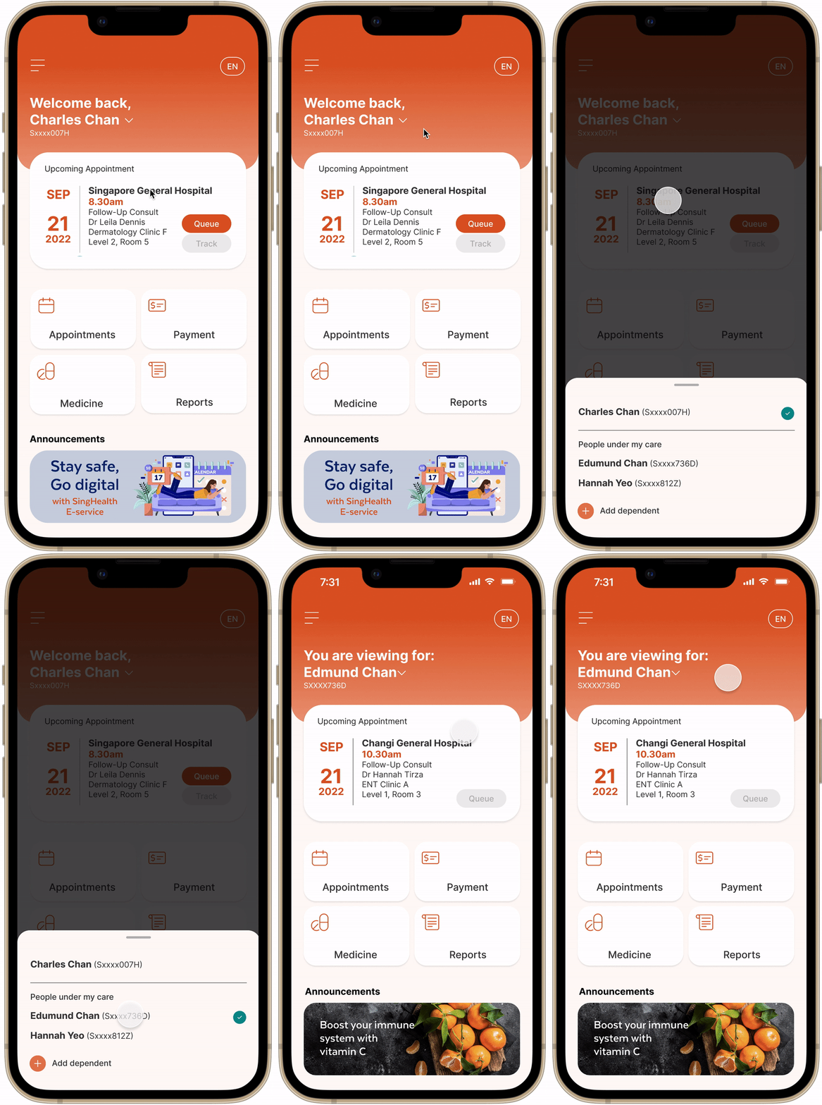
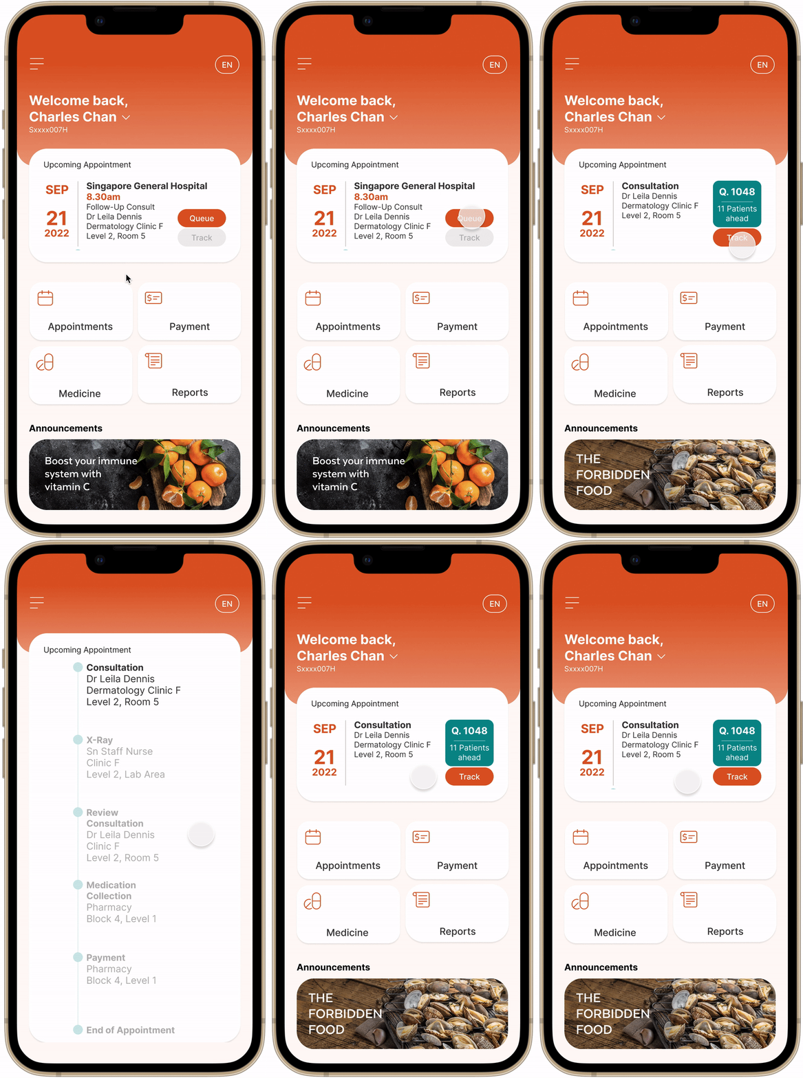
Homepage and eQueue
01
Declutter homepage by showing essential services only (eQueue, Appointments, Payment, Medicine and Reports).
02
Introduce easy switching between patient profiles.
03
Display upcoming appointment on homepage and showed the entire medical journey in "Track" function.
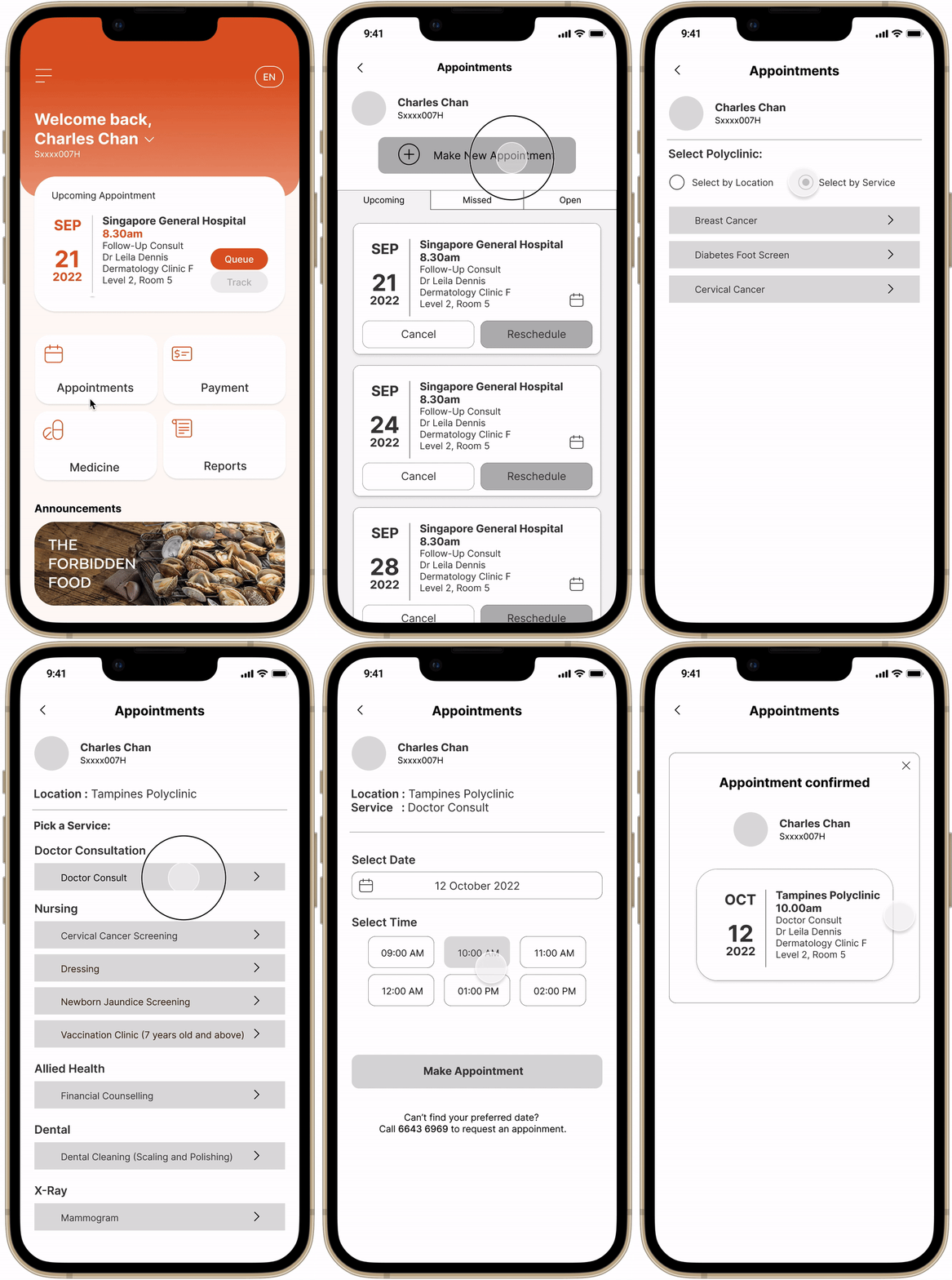
Appointments
01
Display "Recent Places" for easy selection when making a new appointment.
02
Allow users to select by service as well as location
03
Only available dates / timeslots can be selected, so users do not have to tap on each date / timeslot to check.
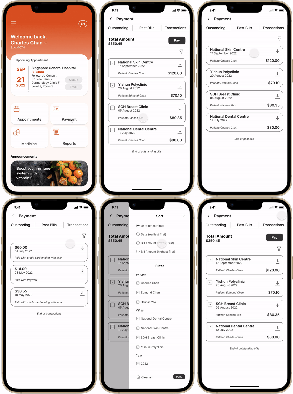
Payment
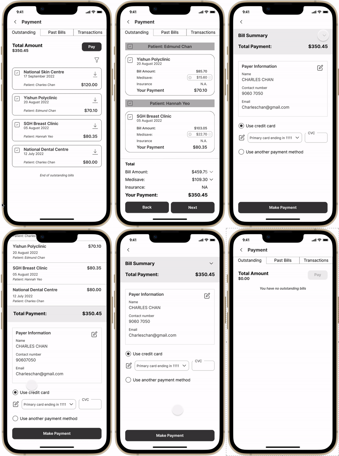
01
Include dependants' bills for users to select and pay together.
02
Filter and sort function added to allow users to sieve through multiple bills quicker.
03
Include user's claimable medisave amount when they pay.
Medicine


01
Include photos and important details of the medicine so users can identify them easily.
02
Allow users to order in partial quantities (similar to what they are able to do in-person at the pharmacy)
03
Allow users to select other payment methods such as medisave.
Health Diary (previously Health Champ)


01
Changed the name from Health Champ to Health Diary so that it is more intuitive to understand.
02
Present user's medical data in a chart so that they can see the progression and changes in one glance.
03
Use a scrolling wheel for certain medical data that might be confusing for users (e.g. systolic vs diastolic blood pressure)
Mid-fi Usability Test
Tasks
[All] Pay for outstanding bill.
[Busy Beatrice] Book new appointment; eQueue prior to appointment
[Cargiver Cathryn] Reschedule appointment for dependent; Check and pay medical bills for dependent
[Regular Rayner] Order medicine refill; Record medical stats
Format
Virtual (Zoom) and in-person
Target Group
Users from our original interview group
No. of Users
8
Findings
Users felt that the app was cleaner and less cluttered. They also thought that the essential functions were intuitive and easy to find. They especially liked:
-
[Homepage] Upcoming appointment shown on homepage
-
[eQueue] Medical journey shown in "Track" function
-
[Appointment] "Recent Places" when making a new appointment
-
[Medicine] Photos and important information shown for medicine.
For the downsides, users were confused about the payment options, in particular Medisave and insurance, as the eligibility for use is highly dependant on case scenario. They also felt that 3 tabs in each function page was too many, and preferred if the eQueue function could provide estimated waiting time.
Deliver
Improvements From Mid-fi to Hi-fi
Armed with the feedback from our mid-fi usability test, we made improvements and created the hi-fidelity prototype.
Mid-fi
Hi-fi

Removed both Medisave and Insurance (to be added when backend processes can be simplified and streamlined)


Remove payment from the Medicine function. To streamline, the medicine bill will be sent to the Payment function instead when it is confirmed.


Added an overlay pop-up informing users about their queue details (including estimated waiting time)


Reduce from 3 tabs to 2 tabs for all function pages.

Hi-fi Prototype
Homepage and eQueue
Payment
Appointment
Medicine
Hi-fi Usability Test
Tasks
[All] View and pay for outstanding bill.
[Busy Beatrice] Identify the tasks that can be completed in the Appointments page; Book an appointment for a specialist service
[Cargiver Cathryn] Change profile; Check and pay medical bills for dependent
[Regular Rayner] Find out information about a medicine; Order medicine refill
Format
Virtual (Zoom) and in-person
Target Group
Users from our original interview group
No. of Users
8
Findings
Users felt that the app was intuitive to use and visually clean and pleasing. They rated the System Usability Score (SUS) score at 78/100, which is a 37% improvement from the current site. They also liked the following:
-
[Appointment] Useful information provided (e.g. fasting instructions for tests)
-
[eQueue] Useful information in the pop-up confirmation
-
[Payment] Able to view bill breakdown in-app without downloading the bill
Users suggested some areas for improvement which included increasing the font size and making the tappable UI elements more accessible. They also hope to see more photos of the medicine for easier identification. Below are the proposed changes to the prototype in the future.


Provide an option for bigger font size
Convert this entire status box into a button for tracking
Use a “x” button to close the progress bar instead of swiping.


Include more photos in the medication detail page


Make the buttons more obvious
Desktop and mobile broswer site
To wrap the project up nicely, we created a browser page to promote the Health Buddy app. This could be included in SingHealth's official website.
Reflections
1. Focus and prioritise
During the course of the project, we often find ourselves struggling with scope creep. The original app was very bloated with features, and the users we spoke to use a variety of functions, so we would inevitably wish to work on every little problem area. However, it is not feasible due to time and resource constraints. We learnt how to prioritise and focus on the main user personas' needs instead.
2. Learn by teaching others
As this was our first group project, we assigned roles based on our strengths. Even then, I've discovered many opportunities to reflect and learn, especially when I guided fellow team members in tasks that I'm more familiar with (e.g. user research and affinity mapping). I gained a deeper understanding and appreciation of my skills.
